Centerpiece choice comes down to how much of the evening you want to spend managing decor yourself.
A single dramatic arrangement drops in as one move; five mismatched bud vases mean five water changes and a frantic search through moving boxes while stems wilt.
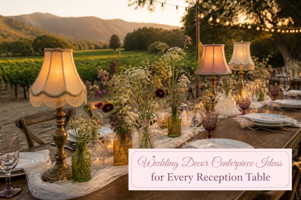
The Santa Ynez winery wedding that paired vintage table lamps with wild florals got it right by letting a sculptural object carry the vertical line, so the flowers could stay low, loose, and nearly self-sustaining through the last dance.
1. Table Lamps and Wild Florals
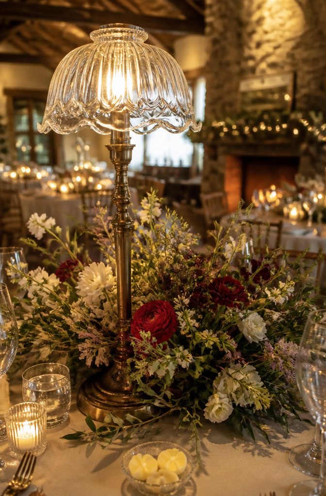
A vintage table lamp with a clear glass shade gives a reception table its height and structure, while wild florals spilling from the base keep the whole thing from feeling too rigid.
I saw this pairing at a Santa Ynez winery wedding where the brides wanted the evening to feel like a chic dinner party, not a formal banquet.
The lamps did the work of candlesticks and centerpieces at once, and the arrangements around them used opened-up blooms with dynamic greenery, neutral whites mixed with red petals, and an untamed shape that looked like it had been gathered from the property that morning.
The lamp itself carries the vertical line, so the florals can stay low and loose without the table looking flat. Butter molded into flower petals and touches of real lavender finished that particular tablescape, though those details are optional.
The hard, sculptural lamp against soft, irregular plant material is what makes this pairing work. For couples working within a tight budget, this approach also means fewer stems needed, since the lamp fills so much visual space on its own.
2. Vintage Lace and White Flowers
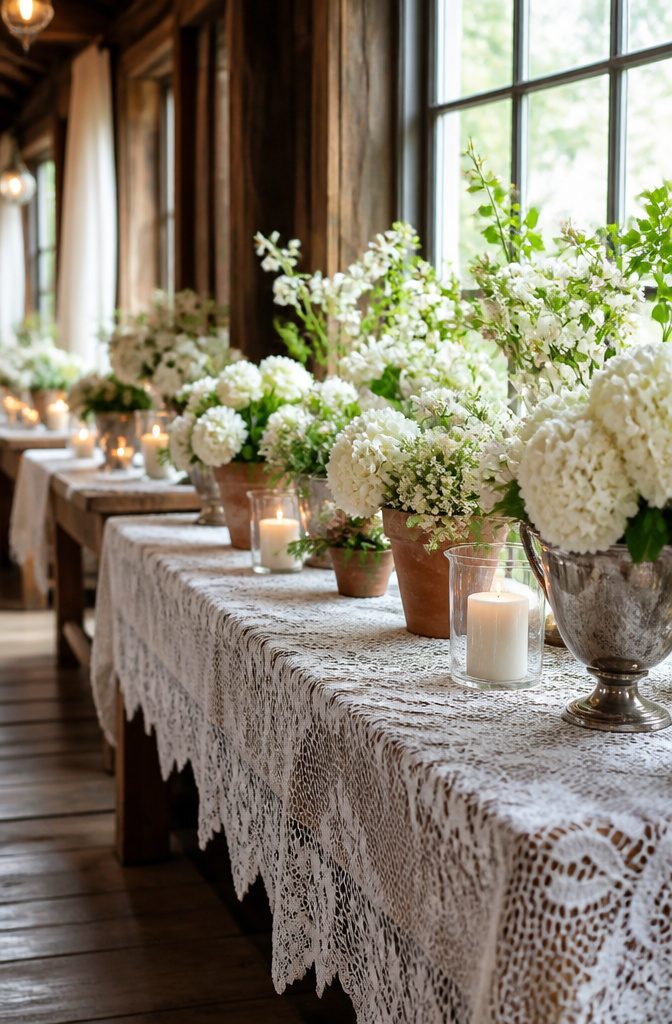
Antique lace carries its own history, which is exactly why it works as a quiet partner rather than a scene-stealer.
At a Blackberry Farm wedding, the couple laid sourced lace tablecloths across the full length of each table, letting the worn edges and openwork set the tone while large white florals in terracotta pots and antique silver vessels sat on top.
The lace adds age and texture without competing; the eye goes to the blooms, then settles back onto the pattern underneath.
For a tighter budget, a single lace runner down the center achieves the same effect with less fabric to source.
Doilies work too, though they read more grandmother’s-parlor than farm-table unless you layer enough of them to blur the edges into one continuous field. White roses, ranunculus, or sweet peas keep the palette restrained so the lace stays visible.
Pillar candles in hurricanes with etched greenery details, like the ones used at that same celebration, extend the glow without adding color that would fight the neutral scheme.
3. Neutral Blooms and Colorful Candelabras
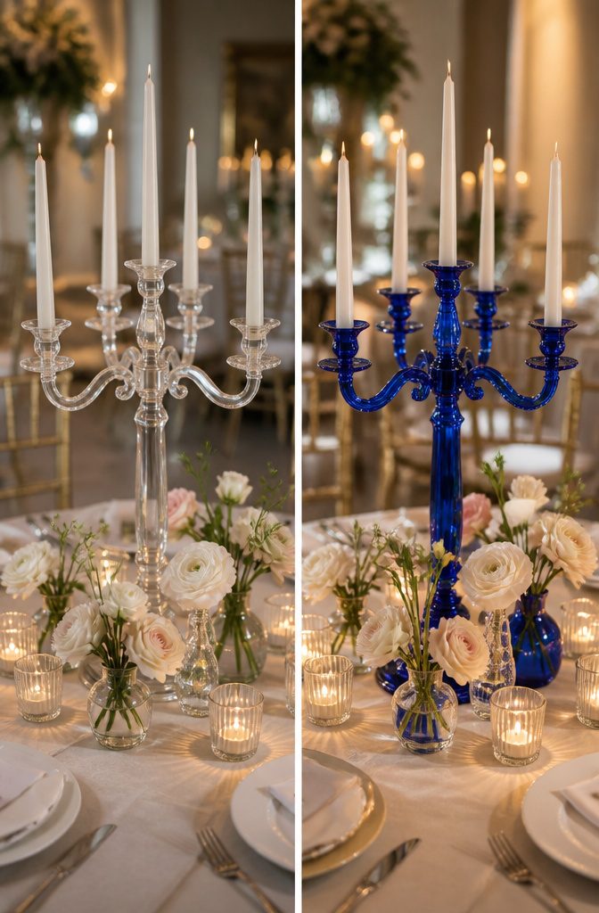
Pale flowers in cream, blush, or taupe need something to push against, or the whole table goes quiet.
A candelabra in emerald, cobalt, or garnet does the work. The saturated color catches the eye first; the neutral blooms soften the edge and keep the look from reading as a dinner theater set piece.
Dial the contrast so neither element overpowers the other.
Three or four pale stems per vessel, kept low and loose, let the candelabra’s height and color carry the vertical interest. Matching every bloom to the candelabra’s tone flattens the effect; the clash is the point.
Colored glass candelabras turn up at estate sales and rental houses that source from European flea markets. Painted metal versions, especially those with a slightly chipped or hand-finished look, come through specialty event rental companies and smaller prop shops.
Buying your own runs the risk of storing a garnet candelabra for years after the wedding, so rent first, and test the color under your venue’s actual bulbs before the week-of panic.
Warm venue lighting shifts cobalt toward purple; emerald can go muddy. The test takes ten minutes and saves a tablescape that looked perfect in the showroom.
4. Spheres of Candlelight
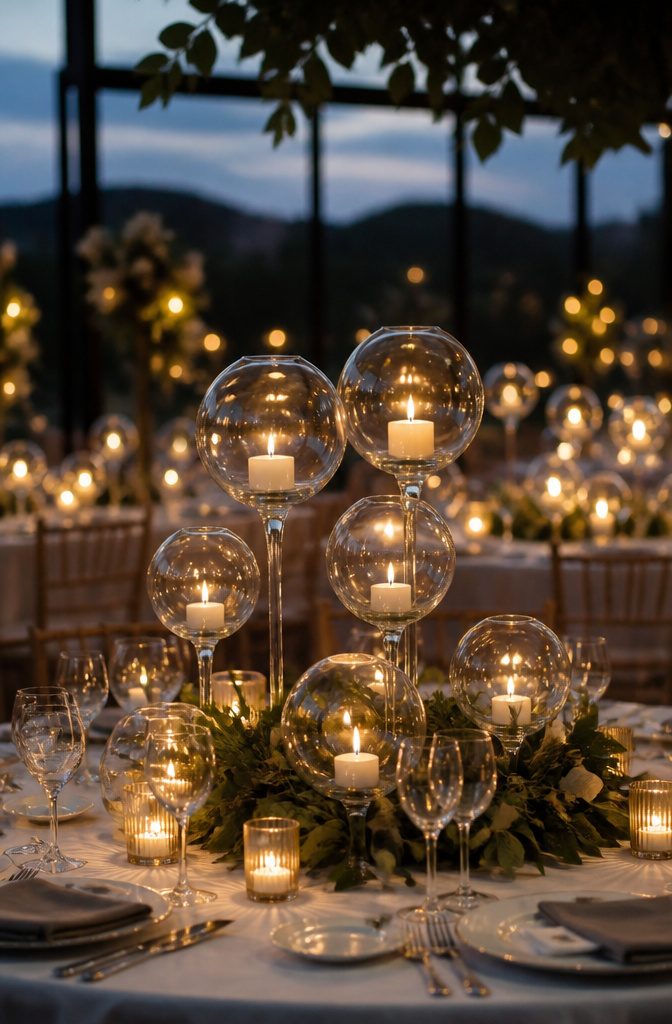
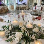
Glass globes clustered at three or four different heights turn each table into its own small constellation.
The orbs catch and multiply flame in ways a straight-sided holder never quite manages, so the same number of candles reads as twice the light once the room dims. That repetition of shape is what makes the effect.
In afternoon light, with windows still throwing color, the spheres look pretty but not dramatic; the glass itself becomes the feature, clean and modern against white linens. After sunset, the geometry disappears and the glow takes over.
Burn time is where this idea tests your timeline. A three-inch sphere pillar typically runs six to eight hours, which covers most receptions but not a marathon evening.
The Miami setup that filled tables brim-to-brim with these spheres used them as the primary light source in an otherwise dark room, which only works if your venue lets you control overhead lighting completely.
If the space has windows you cannot black out, or if dinner runs long, the candles may gutter before last dance.
My preference: size up to four-inch spheres for anything past eight o’clock, or nestle a few LED pillars at the back of the cluster where no guest examines them closely.
The real globes stay center stage for the hour that matters.
5. Pastel Prints and Florals
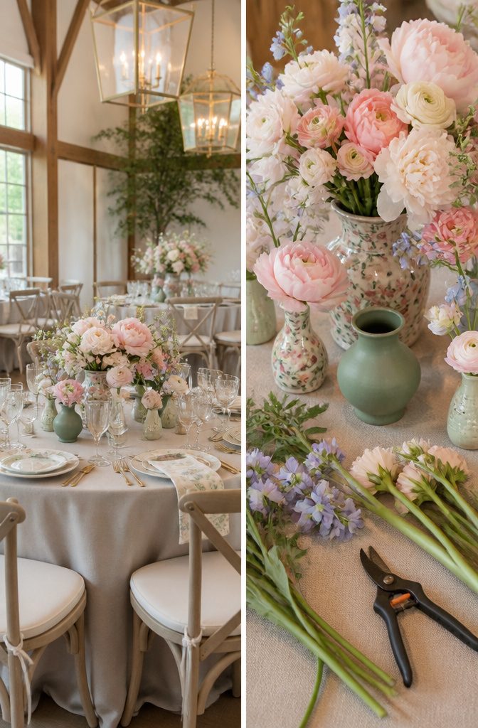
Patterned vessels or linens in soft pastels only work if your eye has somewhere to rest.
I learned this the hard way at a spring wedding where the couple loved a watercolor peony print so much they used it on runners, menus, and the ceramic bases of their centerpieces.
Up close, the tables felt chaotic, like three conversations happening at once. The fix came from the florist: she swapped half the printed vessels for matte sage ceramic and let the flowers carry the pastel story instead.
One printed element per table, maximum two if they share the same palette, became the rule we used after that.
Low arrangements help. Taller prints compete with faces across the table; a runner or a shallow vessel sits below the sightline where the pattern softens into texture.
The Paris wedding that used green and beige floral lamps paired them with plain beige tapers for exactly this reason. The lamps gave the Fragonard fantasy, but the solid candles kept guests from feeling trapped inside a wallpaper shop.
If you are set on patterned china or printed glass, run a test seat at the actual table with the actual napkin and glassware in place.
A print that reads charming from four feet away can turn dizzying at elbow distance.
6. Melange of Wildflowers
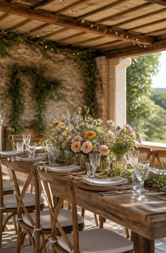
Wildflower centerpieces look effortless because someone made them look that way.
A "meadow mix" from a florist is usually assembled, not gathered; ranunculus, anemones, and sweet peas have never shared a field. Each stem was perfect, but together they felt staged, like a costume party version of nature.
Real wildflowers share a season. Daisies and lavender peak in June and July; black-eyed Susans and goldenrod take over in late August.
When florists assemble "wild" arrangements across seasons, the palette stays pretty but the logic breaks down. Ask your florist which varieties are actually blooming within two weeks of your date, then let the mix follow that calendar.
Glass vessels wrapped in woven rope, set at varied heights, keep the look grounded without matching. The rope matters more than you’d think: it adds the texture that says gathered rather than bought.
One or two stems should stand three or four inches above the rest; anything taller reads as designed, anything shorter disappears. Let the rest fall where gravity takes them.
7. Bud Vases and Blooms
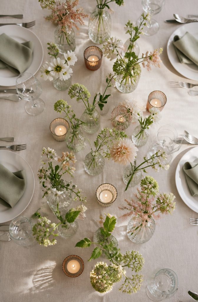
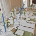
A cluster of bud vases across a table gives guests something to lean into during lulls in conversation, which is what a centerpiece should do.
Three to five vessels per eight-top is the workable spread; fewer and the table looks accidental, more and you’re managing a small florist shop every Saturday.
The spacing isn’t generous, 10 to 12 inches between pieces, close enough that the eye reads them as one gesture but not so tight that a water glass knocks one over.
The math that bites is labor, not stems. One big arrangement drops in as a single move.
Five vases mean five water changes, five stems trimmed to slightly different heights so the cluster doesn’t march in formation, and five surfaces wiped if condensation rings start showing on your linen.
A florist charging hourly rather than per piece will price this honestly, and it often lands higher than a single dramatic arrangement of the same total stem count.
The vessels themselves run cheap, thrift shops and estate sales are full of them, which makes this style popular with couples sourcing their own decor.
What saves money on materials can evaporate in the hours before the reception starts, when you’re still fishing the fourth mismatched vase out of a moving box and the stems have begun to wilt.
8. Something Blue
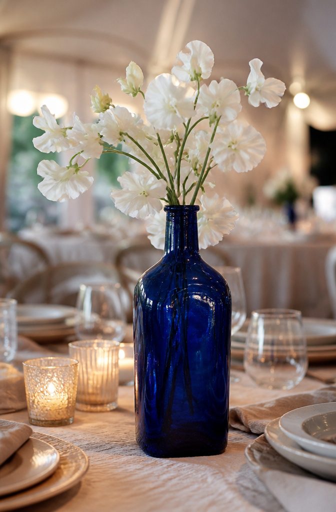
Blue reads as deliberate the second it hits a table. In floral work, blue is not a neutral you can layer underneath anything; it announces itself as cool, distant, and slightly unexpected against the warm palette of most venues.
Hydrangeas carry that weight best, their dense globes sitting low and heavy so the color pools rather than scatters.
Scottish thistle does the opposite, all spike and air, which makes it useful when you want the blue to read as texture first and hue second.
Tinted glass gets you the same statement without fighting seasonal availability. A single vintage cobalt bottle anchoring a few stems of white sweet pea does more than a full arrangement of forced blue roses, and it costs less.
Painted ceramic works the same way: a matte navy vessel against blush or terra cotta reads as intentional rather than matched, which is the difference between a centerpiece that looks designed and one that looks purchased as a set.
The risk with blue is letting it drift toward something you settle for rather than choose. Navy and slate read as sophisticated; powder blue too easily becomes the default of a color scheme that lost its nerve.
If you are using blue, use enough of it that guests notice you meant it. Half measures make the table look like the florist ran short of the planned blooms.
9. Textural Tablescape
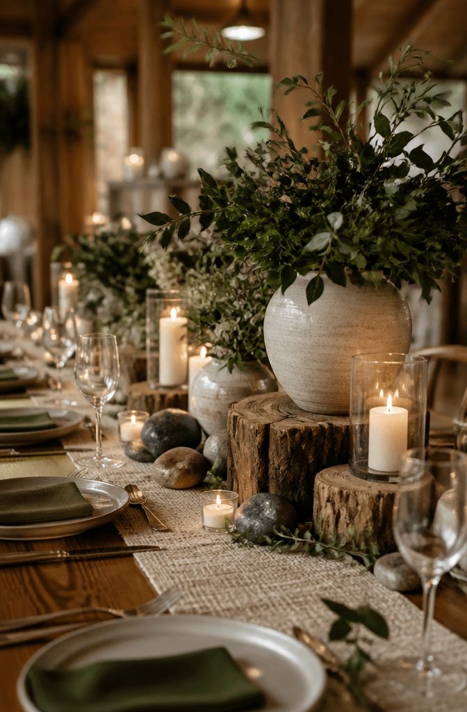
Rough bark cylinders paired with polished river stones create a surface guests want to touch, though most hesitate. The bark catches overhead light and throws tiny shadows that read as depth on camera, while the stone’s sheen reflects it flat.
Nubby linen runners under either element make the photograph work by stopping the eye at the texture border rather than letting it slide to the table edge.
Glazed ceramic vessels hit differently: they photograph as pure color, almost plastic, so the texture has to come from what surrounds them.
A matte terracotta saucer placed beneath a high-gloss pot gives the camera two reads without cluttering the sightline across the table.
Seated guests see the sheen shift as they move; the camera freezes one angle and often loses what made the piece interesting.
The trade-off runs through every choice.
Heavy texture reads as shadow or blur in reception lighting, especially after dusk when most formal photographs happen. What feels luxurious under a guest’s fingertips can look muddy in an album.
I lean toward pairing one aggressive texture with one smooth, never three competing, and I place the rough element lower than eye level so it does not dominate the frame a photographer shoots from standing height.
10. Pink and Green Pastels
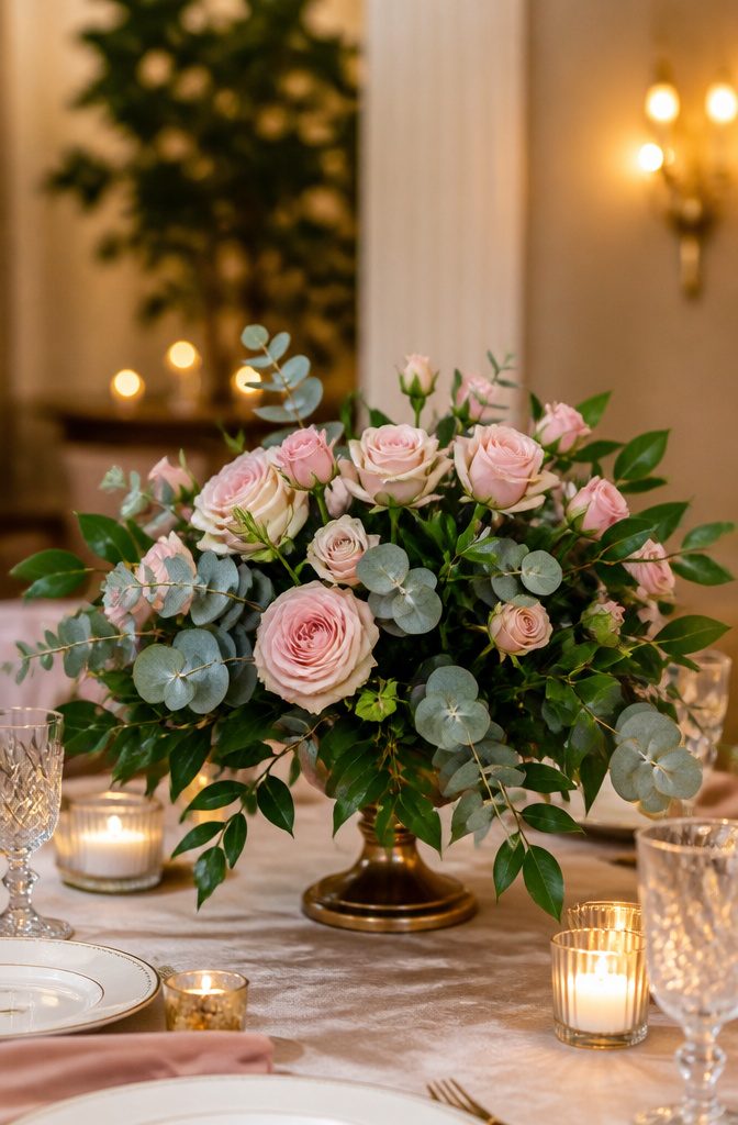
Soft pink roses on their own read as sweet, almost too sweet, until you pair them with foliage that takes up equal visual weight.
Green should read as a color choice, not filler, and that means selecting leaves with presence. Italian ruscus trails with a deliberate line, and its glossy surface catches low candlelight across a table.
Silver dollar eucalyptus gives a rounder, softer silhouette that fills space without looking accidental. For something more architectural, monstera leaves or palm spears hold their own against full blooms and keep the arrangement from feeling like a confection.
The varieties matter because texture changes how the pink registers. Blush garden roses against matte lamb’s ear read romantic and slightly undone; the same roses against waxy fatsia or leathery magnolia feel intentional, almost editorial.
I have seen couples spend half their floral budget on premium blooms only to have them disappear against standard leatherleaf that was never meant to carry a palette.
Foliage-first ordering, where greens are specified by variety and counted as stems rather than thrown in by the bunch, fixes this.
Ask your florist to quote ruscus or seeded eucalyptus as line items, not afterthoughts, and the whole table shifts from default to designed.
11. A Sunset of Roses
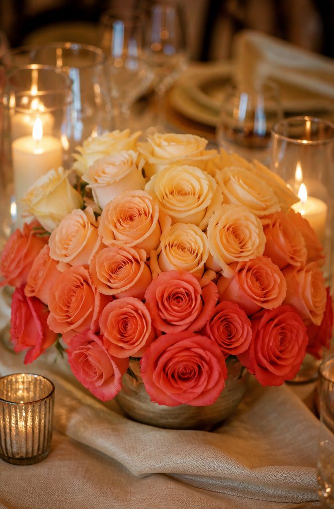
Florists rarely receive roses already sorted in this specific sunset gradient, which is what makes this centerpiece either a splurge or a hands-on project.
Most wholesale lots arrive as mixed coral and peach bunches with no guarantee on shade distribution, so the ombre effect you see on Pinterest is usually built stem by stem.
For a sunset ombré of roses, sort them from darkest at the base to lightest at the tips; burnt sienna through melon to barely-yellow reads as a single gradient.
Two hours of grading yielded enough for six tables; the remaining clusters went into looser cocktail arrangements where the mix looked intentional rather than failed.
If your budget allows, a specialty grower can ship graded stems, though the minimums run high and the timing is unforgiving.
More couples handle this by choosing a single coral or copper variety and letting natural variation do the work, which reads as warm and cohesive without the labor.
The full-gradient version works best for a head table or two focal pieces rather than every guest table; the labor cost balloons fast, and your florist’s hourly rate may exceed the premium for pre-graded flowers.
Water tubes keep these delicate blooms crisp through a long reception, but skip anything tall.
Heavy rose heads droop, and a sunset arrangement that starts vertical ends up looking like a dropped ice cream cone by cake time. Low and lush protects the gradient you paid for.
12. Tonal Tablescape
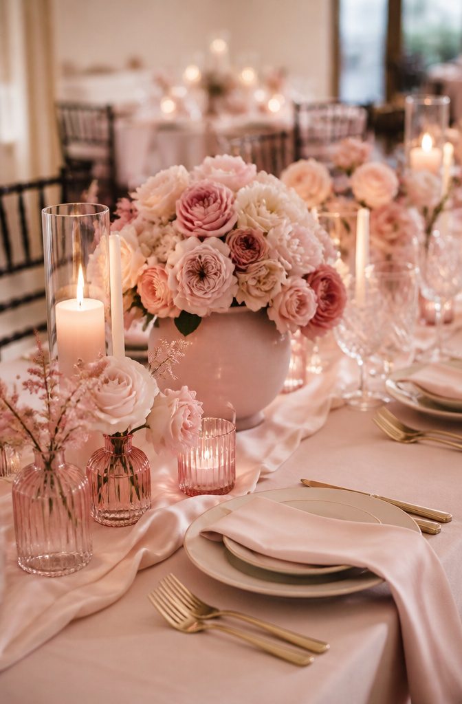
A single-color tablescape lives or dies on what happens after you pick the hue.
I once walked into a reception hall where every element read the same flat mauve, and the effect was less elegant than exhausted, like the color had been photocopied onto every surface.
Texture and sheen variation are what keep tonal centerpieces from collapsing into that monochrome mistake.
Matte ceramic vessels against satin linen, or velvet ribbon wrapped around glass cylinders, create enough visual rhythm that the eye registers difference even when the palette never shifts.
The same dusty rose reads entirely separate in unglazed terracotta versus a high-gloss glaze versus raw silk runners. Without that range, you get a table that photographs as one muddy plane and feels airless to sit at.
The risk shows up most in DIY setups where couples source every piece from the same craft store aisle, chasing consistency too hard.
Satin, suede, crackle glaze, brushed metal, bleached wood: these finishes catch light differently across a table and give the single color family actual depth. Spend your effort there before adding a second color to "fix" what reads as flat.
13. Mossy Mélange
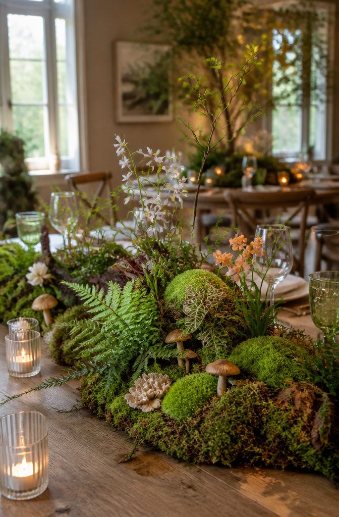
A moss ground layer builds depth in a way flat greenery never quite manages. Small mushrooms, ferns, or woodland flowers pressed into it read as a miniature forest floor, and guests lean in without meaning to.
The trouble is moisture. Living moss holds water like a sponge, and four hours of warm reception lighting will not dry it out, but ten hours of setup through breakdown can leave soft wood tables marked or linens damp underneath.
For a standard evening reception, a light misting the morning of and a shallow tray or plastic liner beneath the moss solves the problem cleanly.
An all-day garden wedding in July is a different calculation: dried reindeer moss or a preserved sheet alternative holds the same visual texture without the wicking risk, though you lose the slight lift of real growth.
Preserved moss runs drier and costs less per square foot, so the budget-conscious trade-off actually favors the safer option for long events.
The ferns matter here too: leatherleaf holds up without water, maidenhair wilts visibly by hour three. Choose based on your timeline, not just the photograph that sold you.
14. Set in Stone
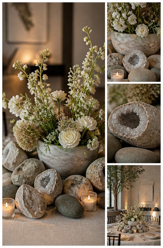
Stone gives a centerpiece weight, literally and visually.
Geodes split open to show their crystal faces, river rocks piled low around votives, carved marble vessels, slate bases under glass. The material reads as permanent against flowers that wilt by midnight.
A full limestone slab once cracked the plywood top of a rental table I watched get dressed. The crew had centered it like a runner, beautiful and wrong.
Rental tables are built light, meant for linen and plate, not geology. The lesson cost the couple a damage fee and a last-minute scramble to level the replacement surface.
For stone that stays put without stress, keep each piece under what one person can lift alone and spread the load.
A slate base 3 inches wider than the vessel it holds distributes weight across more grain lines than a point load. River rock arrangements stay safest because the stones touch the table at many small points instead of one continuous plane.
Marble vessels work if they are hollow; solid blocks belong on the floor, not where guests will lean. Ask your rental house what their tops are rated for before you sign for the pretty rock.
15. Bursts of Blooms
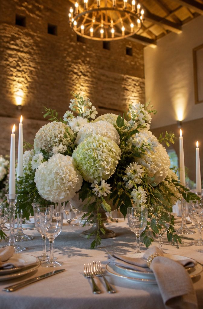
The best bursts of blooms spill over their containers like they are trying to leave, stems angling outward so the whole arrangement reads wider at the top than at the base.
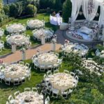
That shape needs room. A round table gives it, because guests sit in a circle and the flowers can claim the center without blocking anyone’s sightline across.
Long rectangles fight this look. The overscaled pieces that make the effect dramatic end up dividing the table into territories, and the guest across from you disappears behind a wall of hydrangea.
I have seen couples try to solve this by pushing the arrangement to one end, which only leaves the other end looking abandoned.
Round tables, 60 or 72 inches, carry one large burst comfortably; rectangles need the piece split into smaller moments down the center, which is a different idea entirely.
The footprint of a true burst centerpiece runs close to two feet across at its widest point, so chargers and stemware tuck in tight.
If your venue only offers long tables, skip this style rather than shrink it. A restrained burst looks apologetic, like flowers that lost their nerve.
16. All About Orange
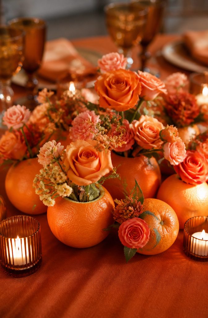
Orange on a reception table walks a fine line between sunset warmth and highway-cone alarm.
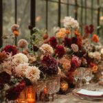
Keep orange warm and earthy rather than loud and synthetic; terracotta, rust, and amber all read as sophisticated, while neon or pure orange tips toward costume.
At a sangeet dinner in Portugal, the planners treated oranges as the main character, not a garnish. Whole citrus fruits ran down the center of the table on orange linens, with white table numbers and candles for breathing room.
The move that saved it from looking like a fruit stand: stemmed roses stuck directly into the fruits, turning the oranges into vessels rather than piles of produce.
That physical transformation keeps the eye moving and stops the color from flattening into one loud block.
For a Mexico City wedding timed near Día de los Muertos, orange marigolds carried the same weight, paired with chrysanthemums and roses in the same bright register. The difference is the shade itself.
Marigold orange carries natural depth; it reads as lit-from-within under candles. Pure citrus orange, by contrast, can turn fluorescent under reception lighting and bounce that tone onto skin.
If the venue runs warm on its bulbs, shift toward the deeper marigold end. If the space is already cool and dim, the brighter orange works as a deliberate jolt of energy.
The common mistake is using orange as an accent and hoping it stays polite. These tables commit fully, which is what makes them memorable rather than jarring.
17. Citrus Style
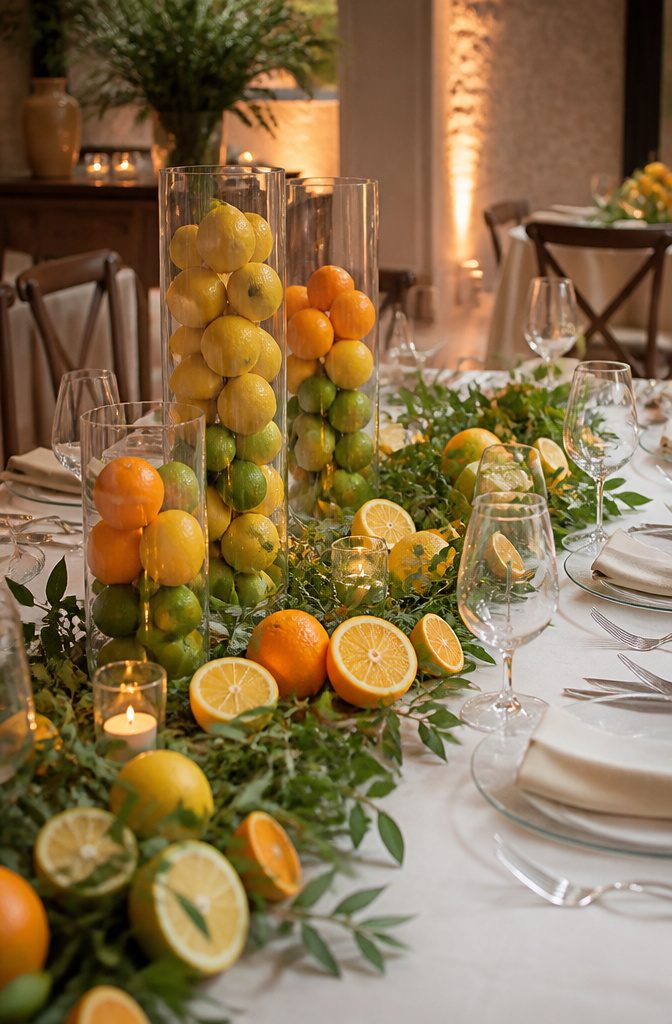
Whole lemons, limes, and oranges stacked in glass cylinder vases read as sunshine itself, and sliced rounds wired into garlands along a table edge give off a clean, sharp scent that no candle replicates.
I have watched this look turn in about four hours flat during a June reception in Gainesville.
The rinds soften first, browning at the cut edges while the flesh underneath goes dull and pulpy; by cocktail hour the vessel water clouds and the garland droops where the weight of rotting fruit pulls the wire.
Plan the setup for four hours maximum, or stage it for the entrance and photos then swap to silk replicas before guests sit. Fresh citrus at 11 a.m. looks lush; by 6 p.m. it is compost.
18. Rows of Roses
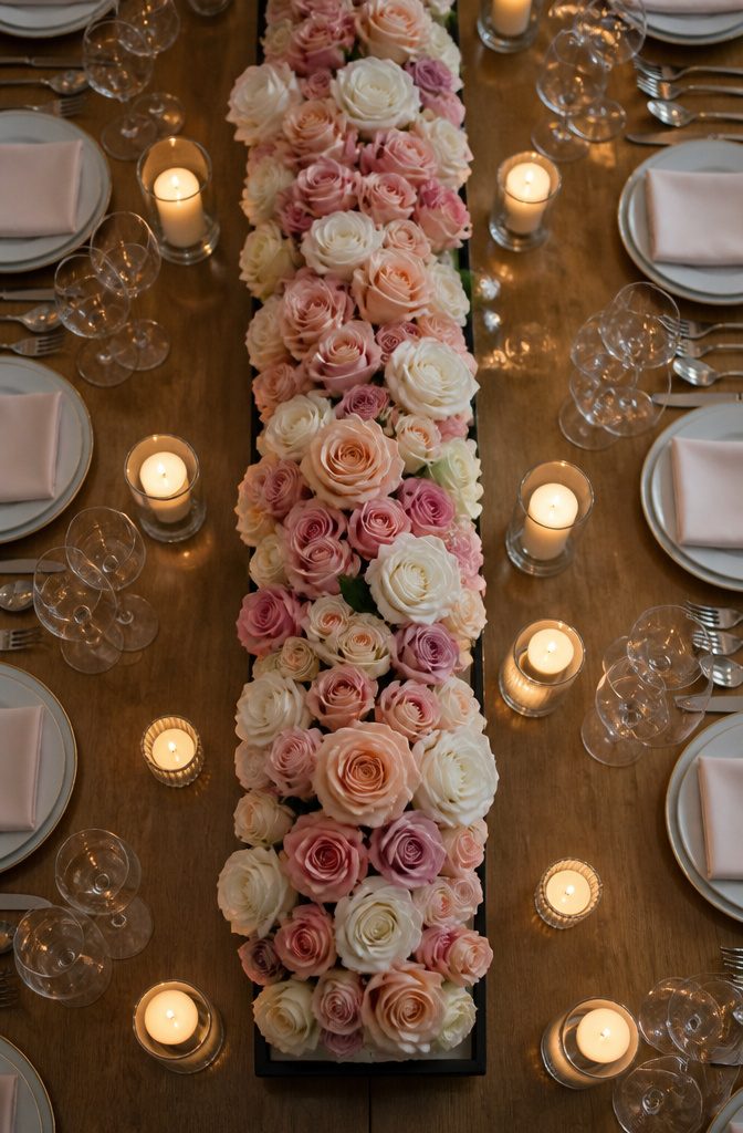
A row of roses looks spare and modern because every stem has to match its neighbors in height, openness, and color saturation.
The eye travels along the line, and a single shorter bloom or a bruised outer petal breaks the rhythm completely.
Grocery-store roses, sold by the dozen in mixed bunches, rarely offer enough uniform stems from one batch to fill even a short trough.
The heads vary in size, the cut points sit at different levels, and the color drifts from deep coral to washed pink within the same sleeve.
For a clean linear arrangement, you need buyer-grade roses graded by stem length and head size, usually through a wholesale florist who sorts by farm and harvest date.
The labor shows in the result: each stem is stripped to the same leaf count, cut to an identical length, and placed at an exact spacing so the row reads as architecture rather than accident.
Low ceramic troughs or metal runners work best, since a tall vessel would fight the horizontal emphasis. Water tubes or floral foam hold the precision overnight, though foam requires careful masking so the mechanics never interrupt the line.
19. Sage and Soft Florals
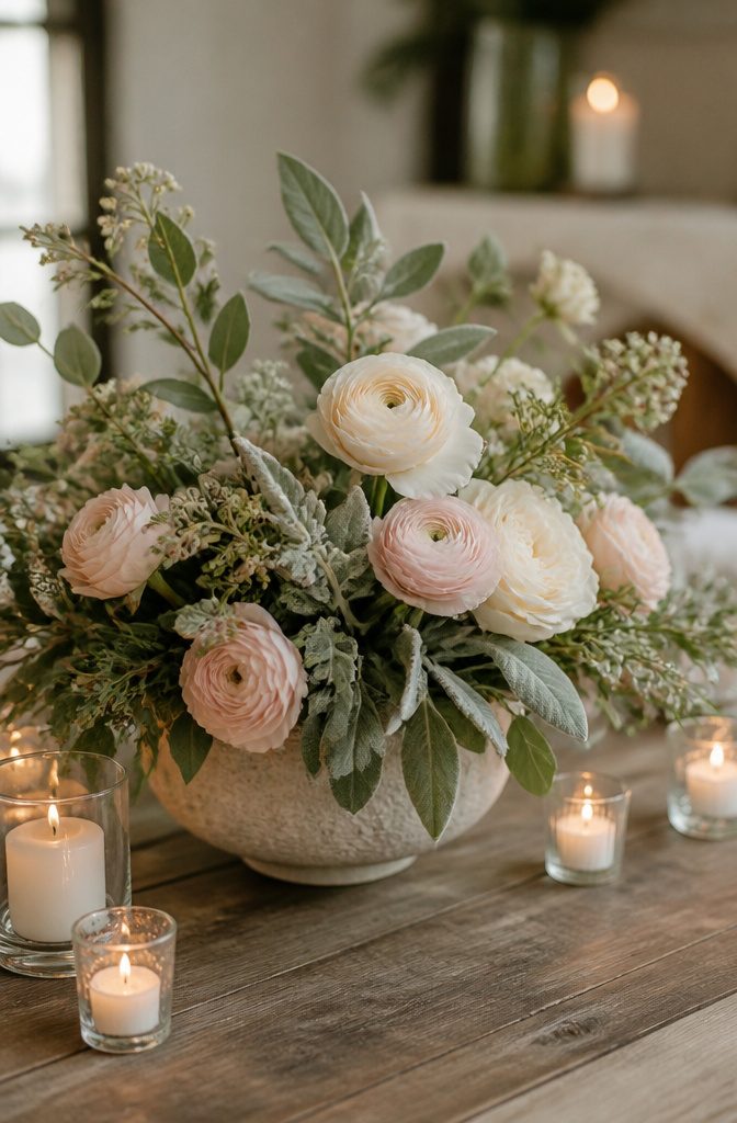
The muted quality of sage foliage photographs three stops lighter than it reads to the eye, a quirk that has saved some centerpieces and flattened others.
Live eucalyptus, olive branches, and seeded dusty miller all carry that gray-green, but each shifts differently under reception lighting.
Eucalyptus tends toward silver in photos, olive stays truer to its original tone, and dusty miller can wash out to near-white if the flash hits it directly.
Pale blooms tucked in, blush ranunculus or ivory garden roses, need to be one value deeper than you think.
In person the contrast feels almost too strong; on camera the sage mutes and the flowers settle into place. Lavender sweet peas work the same way, though they bruise easily and want a water source right to the last hour.
The arrangement itself wants height variation rather than a single dome. A low bowl with branches breaking the line at three different levels catches candlelight between the leaves and gives the eye somewhere to rest.
Without that structure the whole table reads as one soft blur from ten feet back, pretty but forgettable.
20. Warmed Up Whites
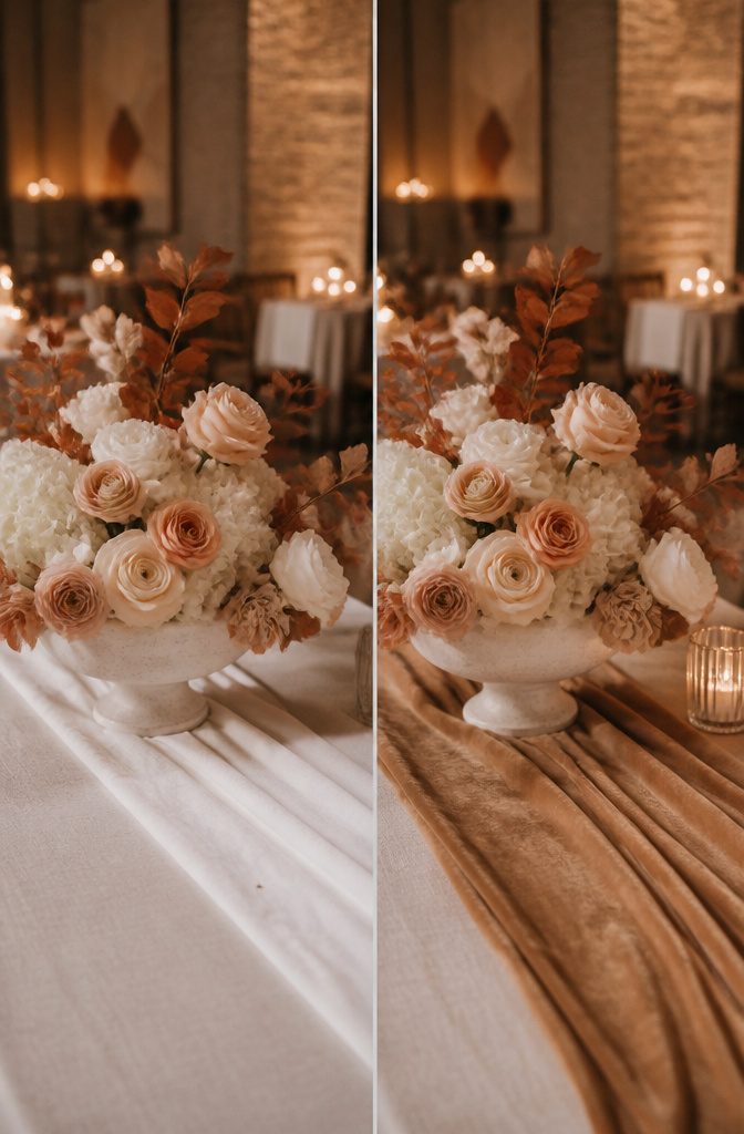
Pure optical white under tent poles and string lights turns flat and chalky the moment the sun drops.
Candlelight shifts every tone toward amber, which is why cream, butter, and pale apricot undertones read as warmth rather than color. A warmed white catches the flame instead of fighting it.
The proof sits in a centerpiece by Whiskers and Willow:
Buttery yellow, pale peach, rosy blush, and soft ivory blooms are offset with hints of rust-colored leaves in this centerpiece, proving that neutrals are anything but boring.
For evening receptions, that shift matters more than the daytime palette. I specify David Austin roses in ‘Patience’ or ‘Keira’, peach ranunculus, and ivory hydrangeas against greenery with bronze edging.
The rust-colored leaves do the same work as dimmer switches, catching candle glow and throwing it back across the linen. Pure white flowers would swallow that light and sit like paper cutouts.
Frequently Asked Questions
Should I have tall and low centerpieces?
Low centerpieces keep sightlines open across the table, which matters more than most couples realize until guests are seated. Tall pieces can work when they rise well above head height and stay narrow enough that faces don’t disappear behind them.
How far in advance should I finalize my centerpieces?
Confirm all centerpieces about two to three weeks before the wedding, once guest count and seasonal flower availability are locked in.
Start the design conversation much earlier with your florist, since specialty items like graded sunset roses or European flea-market candelabras need lead time to source.
What are some good centerpiece ideas for a wedding?
Each pairs a structural element with softer material: hard sculptural objects against loose blooms, or rough bark against polished stone. The variety runs from budget-friendly bud-vase clusters to labor-intensive ombre rose gradations built stem by stem.
How much should you spend on wedding centerpieces?
Bud vases save on stems yet often cost more in labor than a single dramatic arrangement of the same total flower count.
Preserved moss runs cheaper per square foot than living moss and avoids damage fees. Renting colored candelabras beats buying pieces you’ll store for years; sourcing your own vessels from thrift shops cuts materials spending but can evaporate in pre-reception hours.
Where can I find cheap wedding centerpieces in bulk?
Thrift shops and estate sales yield inexpensive bud vases and vintage cobalt bottles. Colored glass candelabras turn up at estate sales and rental houses sourcing from European flea markets.
What wedding decor is trending now?
Tonal tablescapes rely on sheen variation, matte against satin against crackle glaze, to keep one color family from flattening into monochrome exhaustion.