The ideas below run from hardware-store LEDs to rental upgrades that add a few dollars per guest, and the deciding factor is whether your venue gives you something to work with or nothing at all.
A plain white linen table becomes intentional with mixed colored napkins ordered a little over count; a tent with bare farm tables needs only chiffon runners and museum putty to hold the drape.
1. Colorful Floral Centerpieces
Fresh flowers in sunset hues do the heavy lifting on a tight budget. A tight cluster of pink, orange, and peach roses with dahlias and greenery fills the visual space that scatter décor would cost twice to match.
I would choose the gold for evening receptions, where the metal catches candlelight.
Keep the greenery dense and low around the base so the color reads from every seat.
2. Colorful Glassware
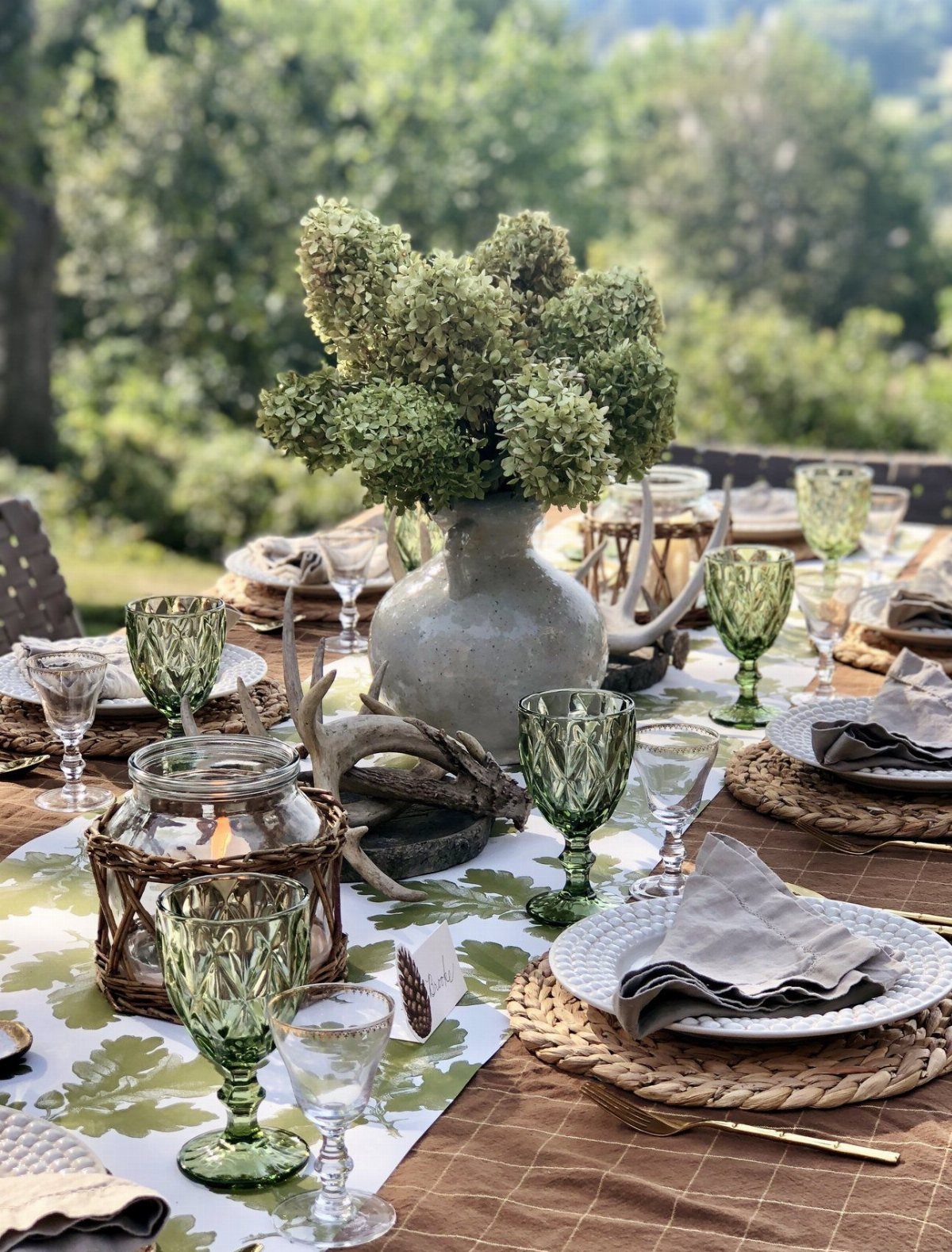
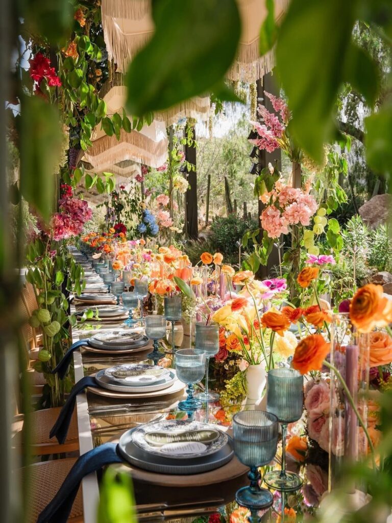
Colored glassware turns every water pour into part of the look. Blue, amber, or pink goblets against gold or white plates give each setting its own accent without buying separate centerpieces.
The green patterned glass in this table pairs with hydrangeas, but the move works anywhere: match the glass to your strongest color and let the rest stay neutral.
Renting colored goblets runs less than you would spend replacing standard rental glass with fresh flowers at every place.
Check that your caterer can source the color in bulk; one or two off shades at a single table undo the effect.
3. Mixed Colored Napkins
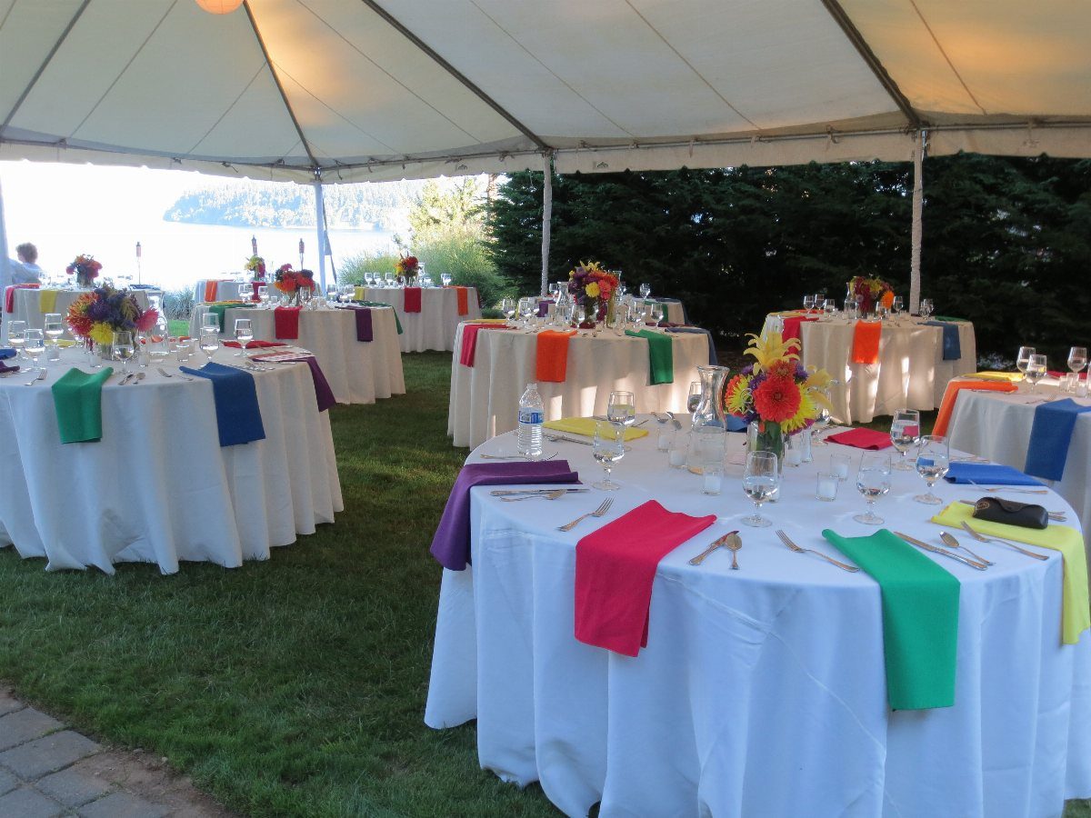
A different napkin color at each seat turns a white table into something intentional for the cost of dye lots. Pink, orange, and lilac read as planned when the linens and plates stay uniform; the variation becomes design, not accident.
Napkin rings or a simple fold keep the look tidy. I have seen this rescue a tent of rental round tables where every surface otherwise matched the one beside it.
Order 20% extra in each color so a stained napkin mid-reception swaps for the same hue, not a mismatch that draws the eye.
4. Colorful Taper Candles
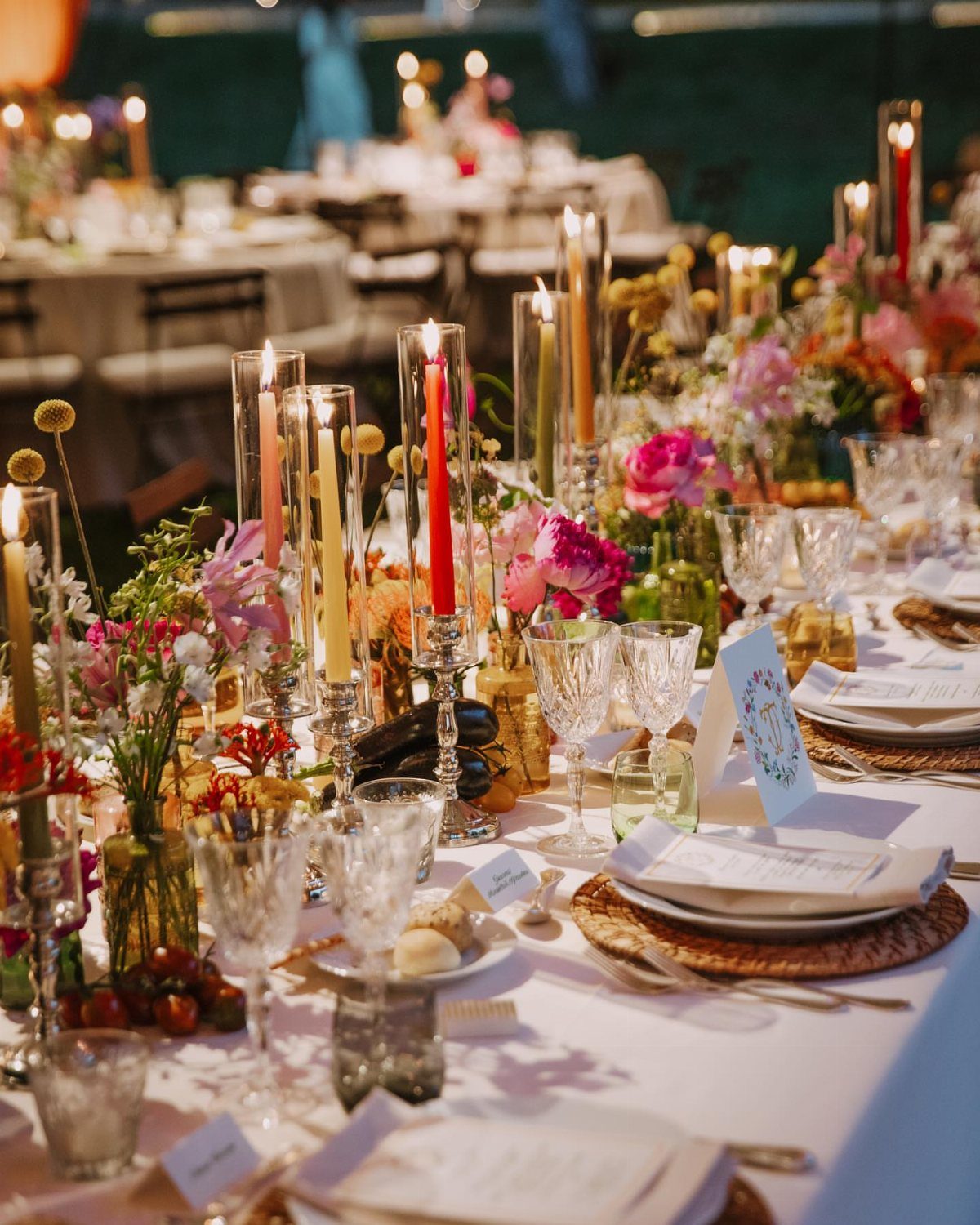
Taper candles in glass cylinders add height and color without competing with low florals. Red, yellow, pink, or green cylinders lit at dusk give a reception its second act as the light changes.
The glass protects the flame from breeze and contains drips, so outdoor tables stay clean. Varying the heights keeps the line from reading as a fence; stagger two or three sizes down the table’s center.
Battery tapers exist now, but real flame still photographs warmer. Check your venue’s open-flame policy before ordering.
5. Patterned Tablecloths
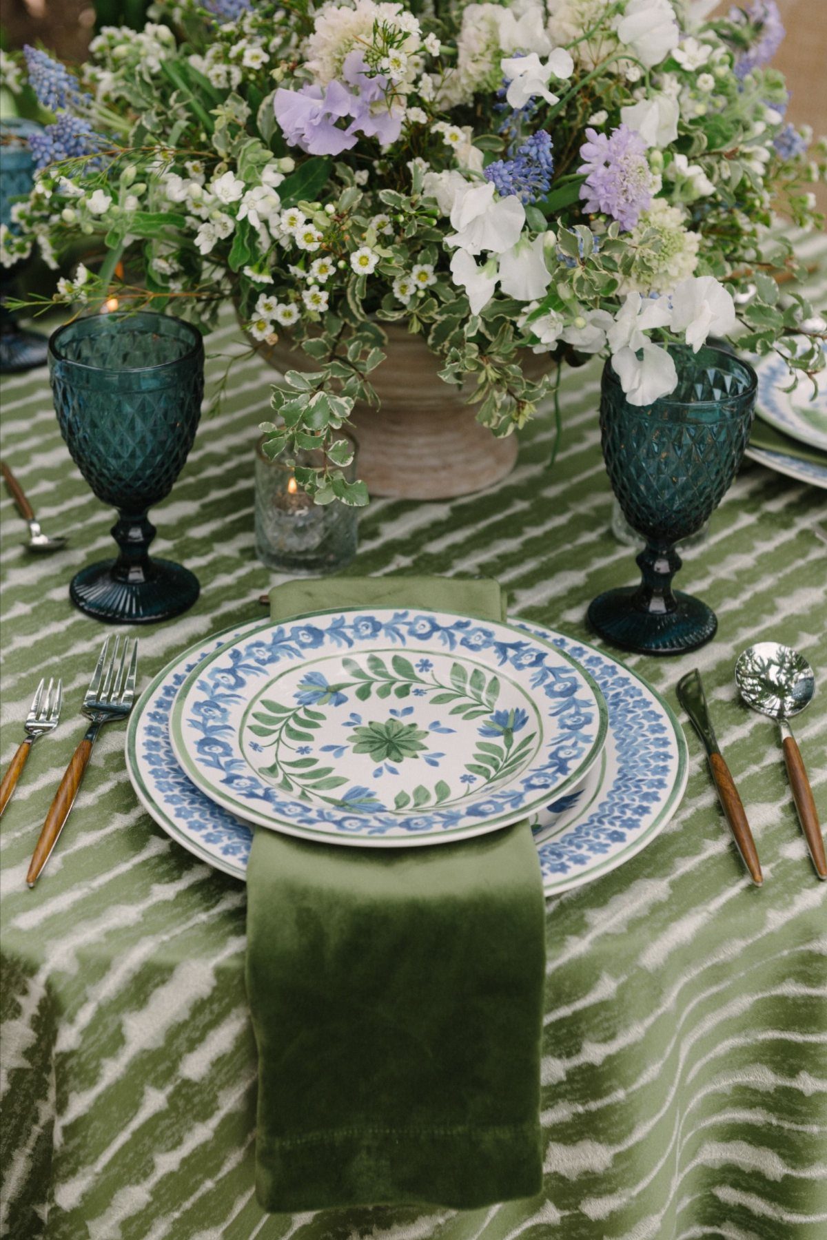
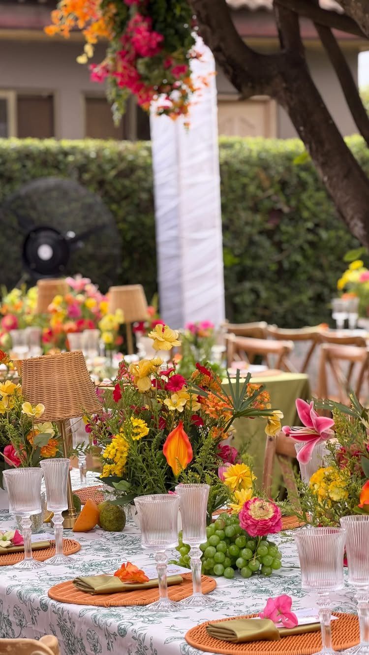
A patterned tablecloth carries the whole color story so nothing else has to compete. Floral or geometric prints in green, blue, or warm tones replace the need for runners, chargers, or elaborate centerpieces.
This table uses the cloth as the base and builds up with patterned plates and colored glass. The reverse, solids below and pattern on top, fights for attention; let the ground be the statement.
Linen rental houses carry fewer patterns than solids, so book early and request a swatch to check scale. A print that reads fine on a small sample can turn busy once it stretches across the full table.
6. Gold Cutlery
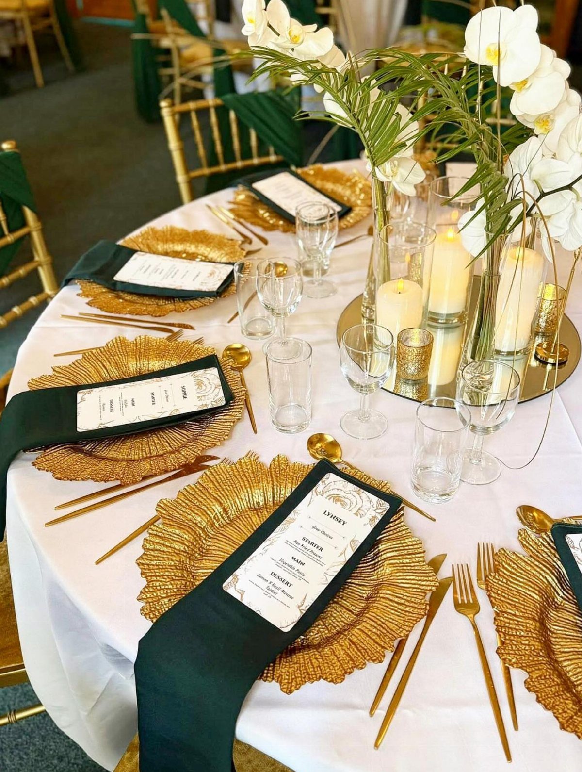
Gold forks and knives warm up a cool palette and dress up simple plates with matching charger plates. Against green napkins or white orchids, the metal reads as intentional luxury rather than default silver.
The finish shows water spots more than silver plate does, so instruct your caterer to dry thoroughly or serve pre-set. I would choose matte gold for outdoor receptions, where bright polish can glare in afternoon sun.
Most rental houses stock gold as an upgrade; the per-piece cost is modest next to what guests actually notice and photograph.
7. Colorful Table Runners
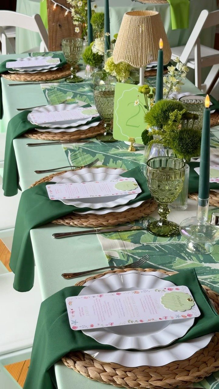
A runner laid over a solid cloth gives you two colors for the rental price of one. Leaf prints or botanical patterns in green, pink, or orange add pattern without committing the whole table to it.
The Oakleaf Paper runner runs 25 feet, enough for most banquet lengths without a seam. Woven placemats underneath add texture that keeps the runner from sliding.
I would choose a printed runner when the venue supplies plain white linens and changing them costs extra. The runner covers the middle third and leaves the rest neutral, so the eye rests.
8. Eclectic Vases
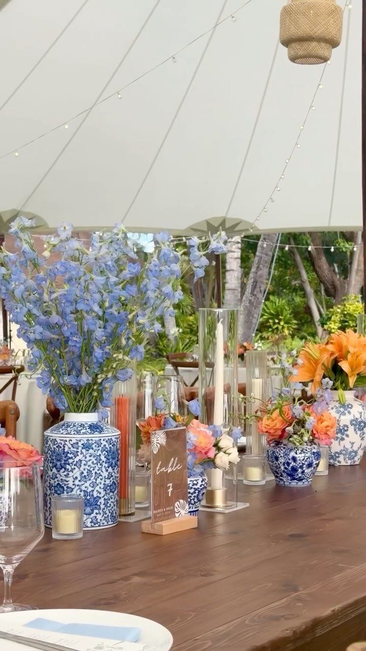
Mismatched vases turn a single flower type into a collected look. Blue-and-white ceramic, clear glass cylinders, and stone vessels on one table read as intentional variety rather than rental shortage.
Keep one element consistent across all of them: the same bloom in each, or heights that fall in the same range. Without that anchor, the table looks like a yard sale.
Stone and ceramic hold water longer than thin glass, so use them for hydrangeas or roses that drink heavy. Glass cylinders suit tall grasses or single stems that need support.
9. Brightly Colored Chairs
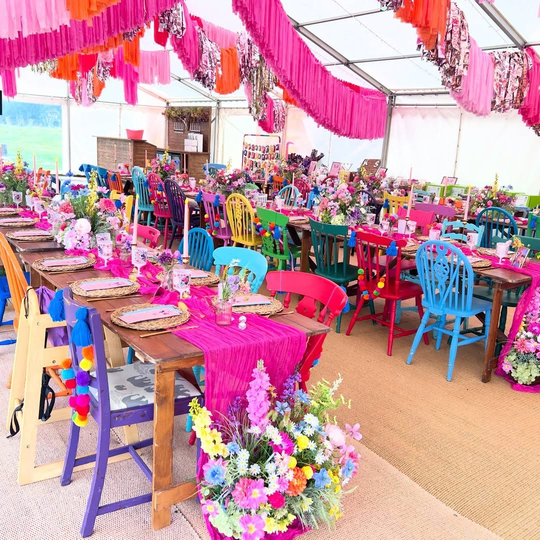
Painted chairs in pink, blue, green, or purple do what linens cannot: they carry color at eye level, where guests actually sit and talk. Against a neutral tent or lawn, the effect is immediate.
Wooden folding chairs take paint well and stack for transport; rental houses in college towns often stock them in team colors that convert to wedding palettes.
The fringe ceiling in this tent echoes the chair colors upward, so the whole space coordinates.
Check that paint is sealed; unseated guests lean against chair backs, and fresh color transfers to white linen.
10. Gold Chargers
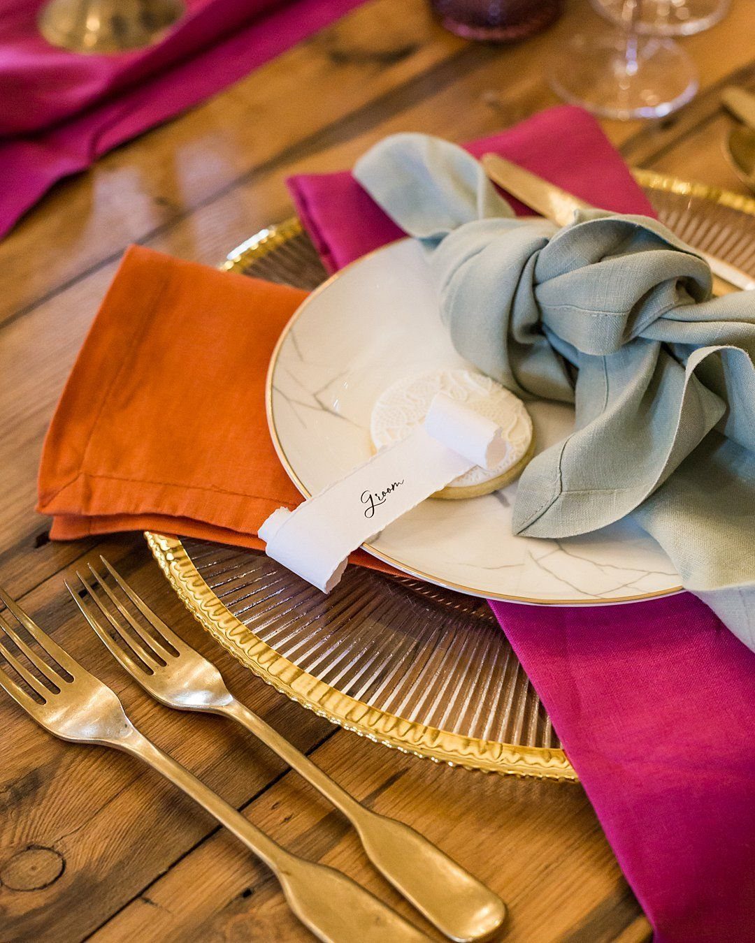
A charger under the plate frames each setting like a picture mat. Gold ribbing catches light even in daytime, and against bright napkins the metal reads warm rather than flashy.
The charger does the work of a colored plate at half the rental cost; you set the food on white china and lift it away for cake.
I would choose ribbed or hammered texture over mirror finish, which shows every fingerprint.
Most rental houses stock chargers as an upgrade tier; ask whether they include cleanup or charge extra for the polishing that gold requires.
11. Floral Patterned Napkins
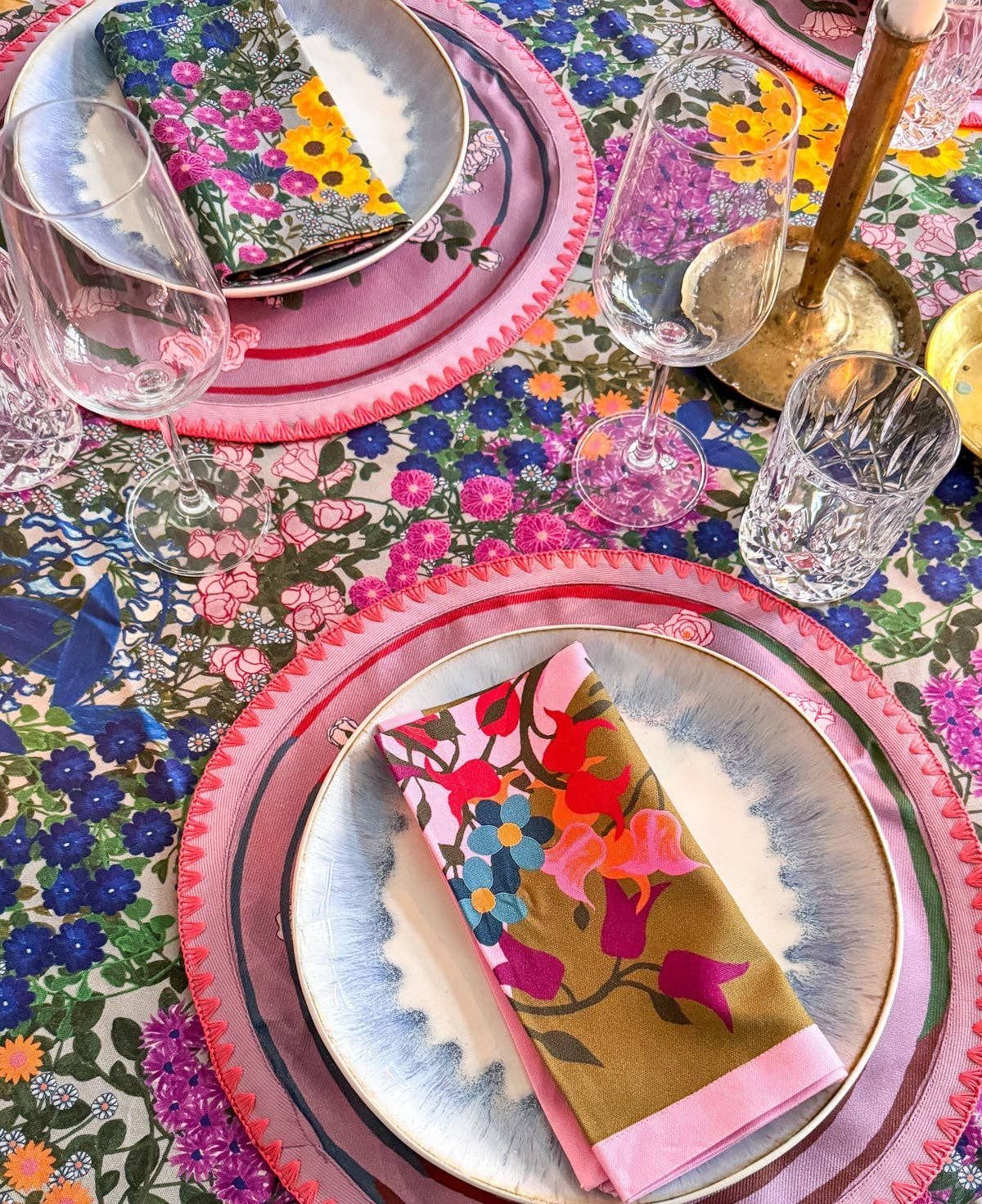
Fold patterned napkins so they read as a print from above and feel like a solid color once a guest picks one up.
Floral on floral, as in this table, works when the scales differ: large blooms on the cloth, tighter pattern on the napkin.
The napkin is the cheapest place to add pattern; you buy or rent fewer square feet than a tablecloth, and stains hide better on print than on solid pale linen.
Iron or steam before folding; creases across a pattern break the design line.
12. Outdoor Table Settings
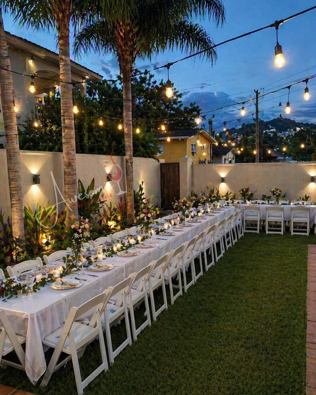
White linens on grass gain color from what surrounds them: orange and pink blooms, patterned plates, the water behind. The setting does not supply color; it reflects what you bring.
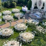
String lights overhead stretch the usable hour past sunset. Long tables seat more guests in less tent space than rounds, and the linear setup suits family-style service that keeps plates moving.
Wind is the real enemy.
Glass cylinders around candles, weighted centerpieces, and clips on every cloth edge keep the look intact through cocktail hour. Book a backup tent even for dry-season dates; afternoon storms in Florida arrive fast.
13. Candles in Glass Holders
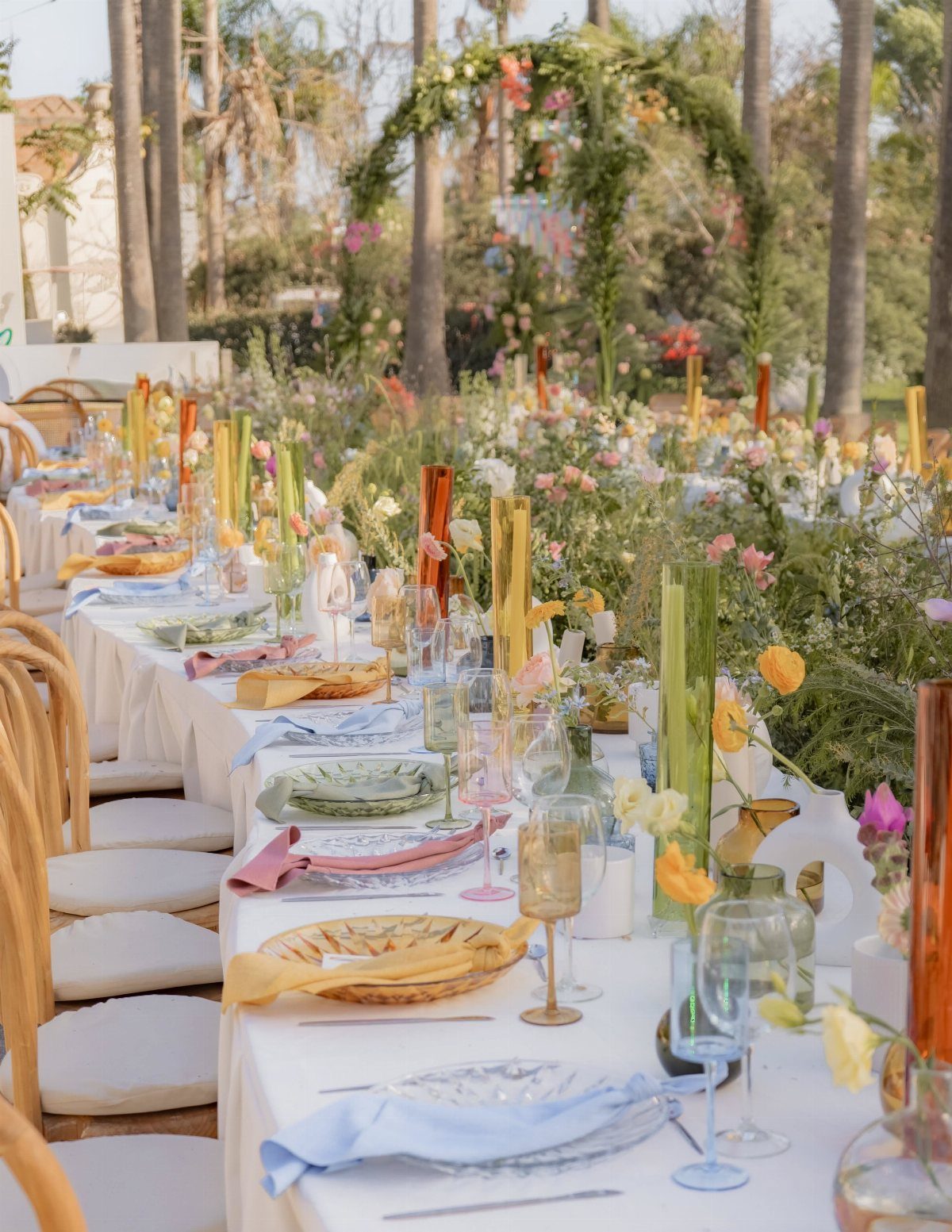
Glass holders turn any candle into a color piece. Amber, green, or clear cylinders clustered down a long table repeat the glassware tones without matching them exactly.
The height variation matters more outdoors, where wind hits uniform rows harder. Short holders suit tea lights for early hours; tall cylinders carry the look past sunset when they matter most.
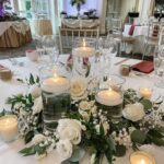
Floating candles in shallow holders give the same glow with less wax, though they burn faster. Check that your florist’s arrangement heights leave sight lines across the table; glass cylinders add a couple inches above the flame line.
14. Chiffon Runners
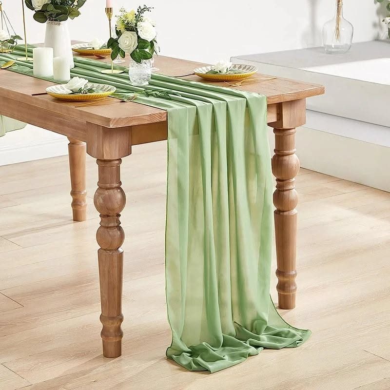
Chiffon drapes like water and costs less than most linen upgrades. A sage runner over bare wood, puddling at the ends, gives a reception tent the softness that tablecloths would bury.
The fabric slides, so secure it with discreet dots of museum putty or weight the ends with small floral arrangements. Pastel chiffon reads bridal; deeper mauve or lilac shifts toward evening drama without the weight of velvet.
I would choose chiffon for farm tables the venue provides free, where a full cloth rental doubles the table cost. It wrinkles less than silk and packs small for destination weddings.
15. Brightly Colored Tablecloths
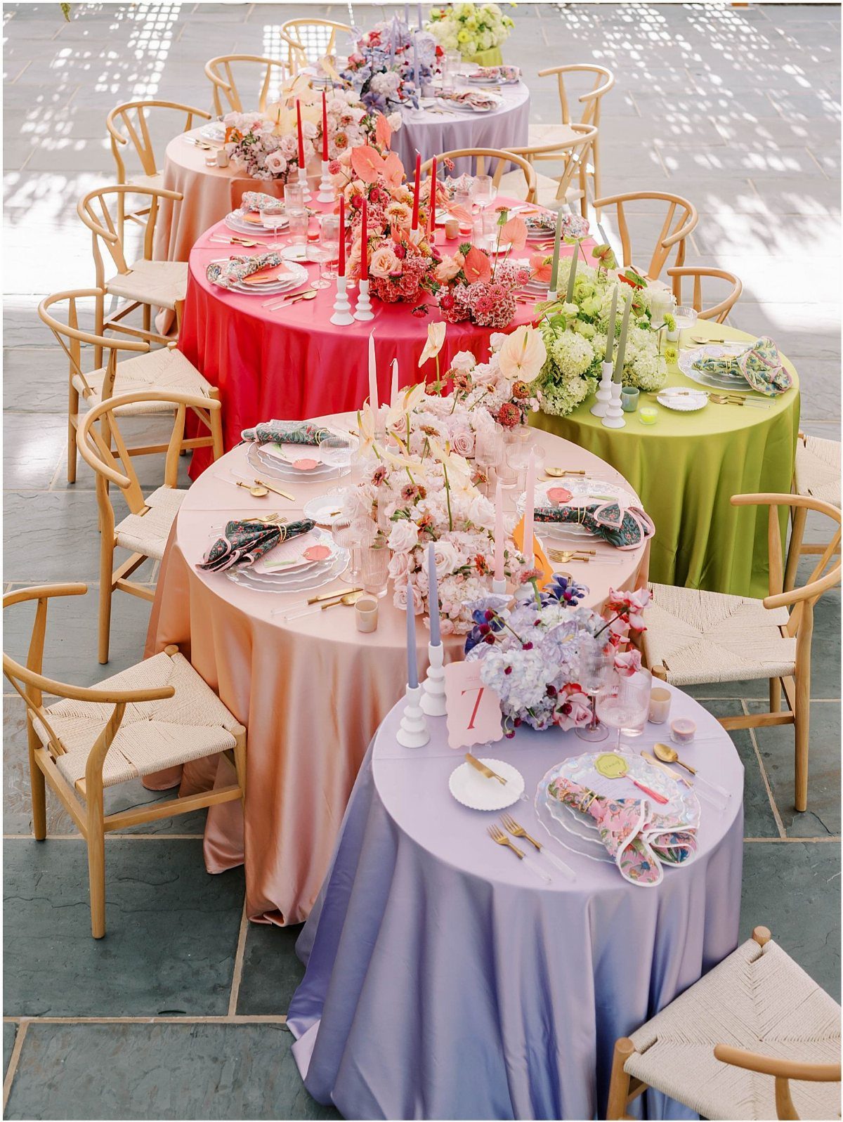
Saturated tablecloths in pink, green, or purple do what white cannot: they make the room before a guest reaches the centerpiece. Each table becomes its own color block, and the collective effect is a garden at scale.
The trade is that plates and glassware must compete or surrender.
White china and clear glass hold their own; patterned plates fight the cloth and lose. This table stays disciplined with solid chargers and simple flatware.
Satin reflects overhead light; matte cotton or linen absorbs it. Choose satin for evening when uplighting matters, matte for daytime tents where sun on shiny cloth glares.
16. Gold Candle Holders
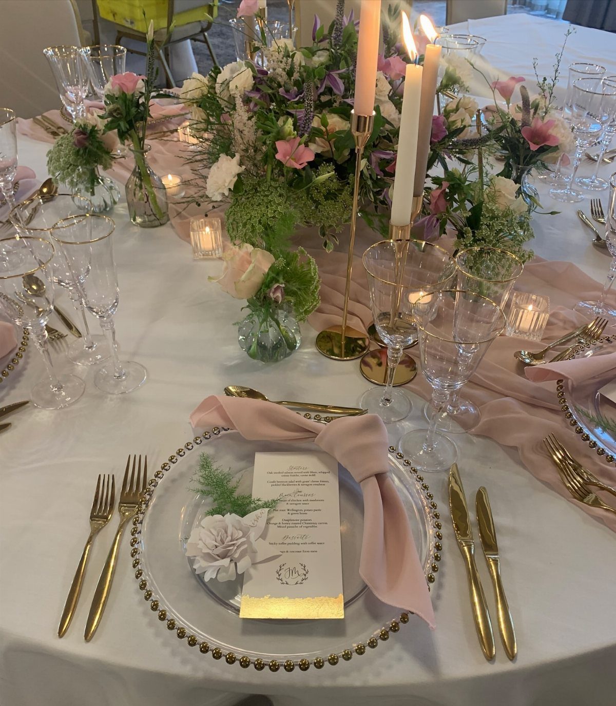
Gold candle holders do what gold cutlery does at a third the table coverage. A pair of tall tapers in fluted gold holders frames a centerpiece without crowding it, and the vertical line draws the eye up from plate level.
The holder finish should match or intentionally miss the flatware; near-match golds read as mistake. This table pairs hammered holders with ribbed chargers, both warm but distinct.
Polished holders show dust within an hour of setup; matte or antiqued finishes forgive a venue’s prep timeline. Place holders slightly off-center so the taper leans toward the table’s middle, not a guest’s sleeve.
17. Colorful Table Settings
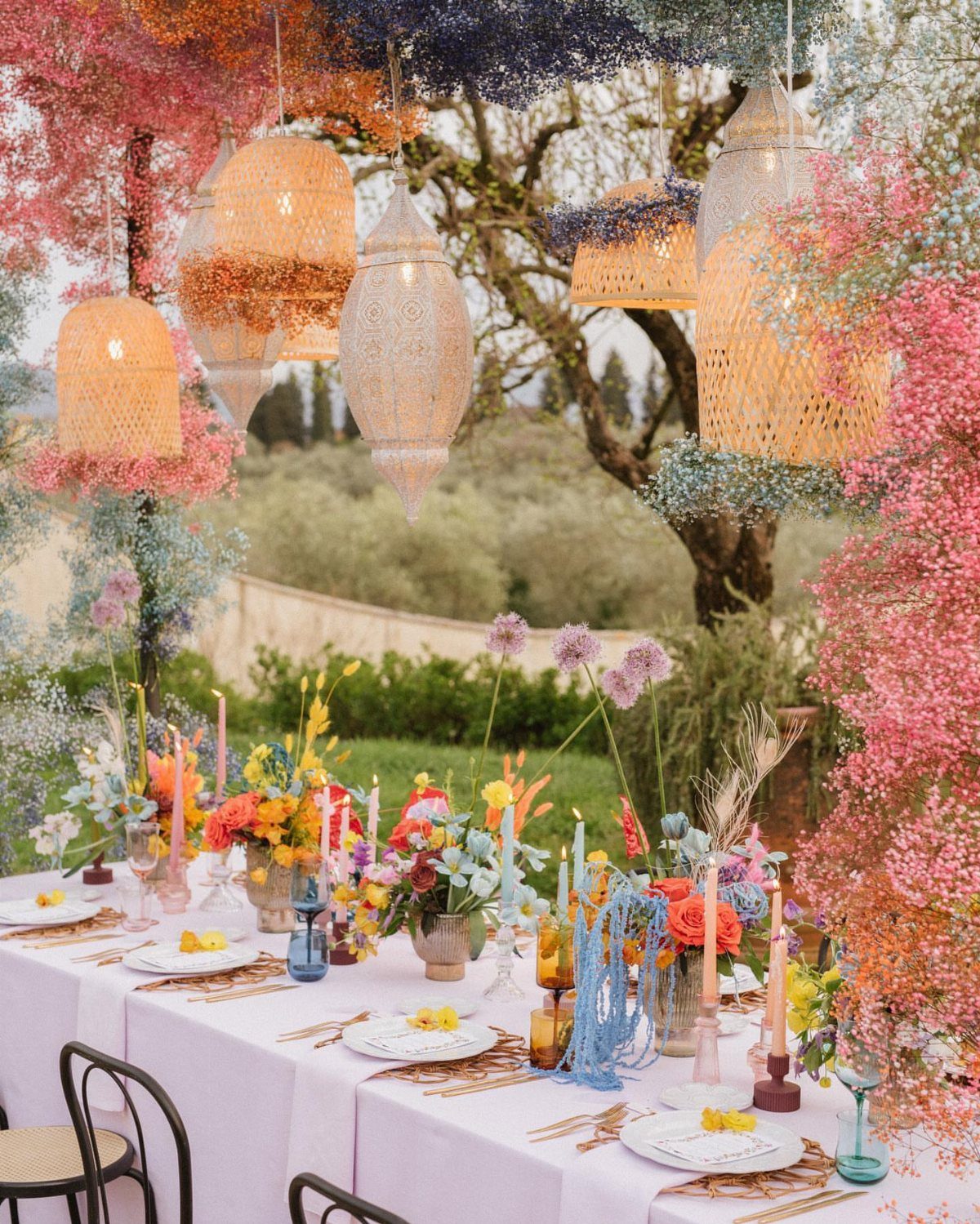
A colorful table setting succeeds when one element leads and the rest follow. Here, suspended baby’s breath and woven lanterns overhead establish the palette; the table below repeats those tones in florals and glass without competing for attention.
The common error is adding every color found on Pinterest. Choose three that appear in your flowers, your venue’s natural surroundings, or both, and let the fourth happen by accident in candle flame or skin tone.
Lanterns at varied heights need anchor weights in wind. Test your knot work the morning of; fishing line shows in photographs if it catches light wrong.
18. Elegant Place Settings
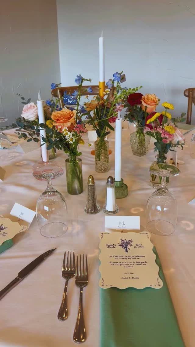
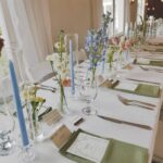
Elegance in a colorful setting comes from restraint in the non-color elements. Green napkins, silver flatware, and clear glass give the eye somewhere to rest between bright florals and patterned menus.
Hand-lettered place cards at each seat slow the seating rush and photograph as detail.
The maker of this mountain wedding noted the elevation, 10,200 feet, where paper curls and adhesives fail; at altitude, weighted card holders or pressed flowers keep place cards flat.
Printed menus work best when the courses are legible at arm’s length; guests read them while waiting, not under lamplight. Choose a printer who proofs at actual size, not screen scale.
19. Colorful Fabric Sashes
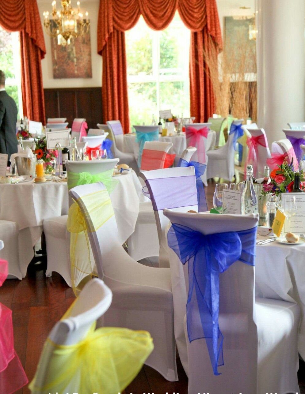
Fabric sashes on white chair covers let you color-code tables by guest group or mix hues across the room without renting colored linens.
Tangerine and fuschia paired together read as celebration rather than decoration; the sheer fabric catches light that opaque chair covers would absorb.
Tie knots rather than bows for a cleaner silhouette that stays put through dinner. Satin or organza slides less than chiffon, which is worth checking if guests will shift chairs between ceremony and reception.
I would choose sashes over full chair covers in summer; less fabric means less heat trapped against guests’ backs.
20. Eclectic Table Settings
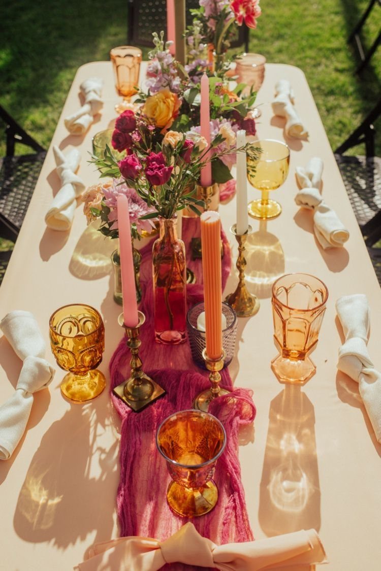
An eclectic table builds from what you already own or can borrow: brass candlesticks with colored tapers, amber glassware that never matches, napkins knotted instead of folded.
The magenta runner in this setup anchors the chaos; without one strong horizontal, the eye has nowhere to land.
Mismatched works when one element repeats.
Here, the warm metal of candlesticks echoes in brass details elsewhere, and the flower colors stay in the same sunset family. Random without that thread reads as accidental.
Outdoor grass settings forgive more variety than a ballroom would; the natural ground softens the clash. I would keep plates white and let the layers happen above them.
21. Colorful Dessert Tables
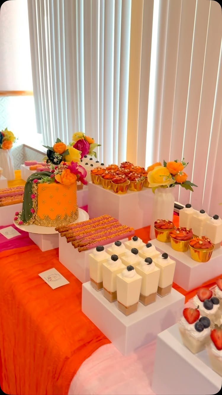
A dessert table carries color through the final course when the dinner tables have gone neutral. Orange fondant, green draping, and matching runners let the cake stand act as a second centerpiece that guests photograph rather than passively receive.
White cake stands against bright cloth keep the sweets readable; dark plates would bury pale mousse. Floral arrangements at the back frame the display and repeat the dinner table palette so the room holds together.
I would set desserts at eye level on tiered stands rather than flat; guests circulate around a reception and see the table from across the room before they approach.
Color Combinations
Pink and orange sit next to each other on the wheel, so they warm each other up without fighting.
Blue and gold do the opposite job: the warm metal against cool glassware snaps the eye awake. I have seen teal runners with dark plates work the same way, the dark ground letting the brighter color move forward.
3 colors is the practical limit. Pink, purple, and orange with a teal runner, or fuchsia with hot pink and emerald, give you 2 starting points that already feel finished.
The eye reads that as energy, not clutter, because one tone ties them: all warm, or all saturated at the same level. Add a fourth and something starts to look leftover.
Dark glassware on wood does what dark plates do: it gives the flowers something to glow against. The table becomes the frame, the arrangement the picture.
Seasonal Themes
Spring tables lean on what is already growing.
Pastel wildflowers in bud vases need no forcing; they cost less than hothouse blooms and read as timely rather than cheap. White cloth and clear glass let irregular wildflower shapes carry the season without competing for attention.
Summer asks for more saturation.
Sunset tones, orange and pink deepening toward red, match the longer light. The floral centerpieces in the list, roses with dahlias in sunset hues, belong to this season; the color is already outside.
Fall and winter shift toward weight. The notes do not name them, but the logic holds: deeper mauve or lilac chiffon from the list, gold candle holders against shorter days.
What changes is the temperature of the color, not the method. The same rules of one leading element and the rest following apply; only the palette moves with the calendar.
DIY Elements
Homemade centerpieces start with what grows within driving distance.
Local dahlias in August, forced branches in March: the season does the work of a color scheme. Clear glass cylinders from a restaurant supply store cost less than florist rental and show the stems, which is part of the look.
The list notes paper curls at altitude; at sea level in Florida, humidity is the risk. Heavy card stock holds up, or pressed flowers laminated flat.
The knot work in the colorful table settings entry, fishing line for suspended lanterns, is a skill not a purchase. Test in daylight, days before, when you can still see the tangle and fix it.
Budget-friendly Options
Local flowers in season cost half what shipped blooms do, and they last longer because they were cut yesterday. White cloth and clear bud vases keep the table quiet; the color comes from what grew nearby, not from dyed imports.
Fairy lights across wooden beams, from the minimalist notes, cost less than floral ceiling treatments and travel with you if the venue has beams to hold them.
The light is the decoration; the fixture is a string of warm white LEDs from any hardware store.